Space
Space defines the whitespace between elements, setting visual standards for proximity, rhythm, and alignment.
Three spatial concepts are woven into the fabric of all Spirit system components, creating a unified visual order: inset space within components, vertical stack space between elements and components, and horizontal inline spacing between elements in a row.
Inset
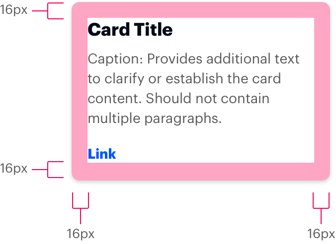
An inset applies padding on all sides of a block or inline element. By default, all four sides are equal.
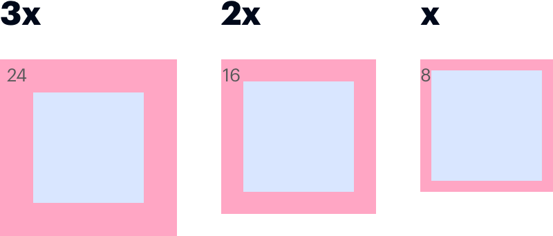 Apply an inset token to any container, such as a card or a or table cell, to create consistent padding around the content.
Tokens
| Token | Value | Preview |
|---|---|---|
|
|
64px |
example |
|
|
48px |
example |
|
|
40px |
example |
|
|
32px |
example |
|
|
24px |
example |
|
|
16px |
example |
|
|
8px |
example |
|
|
4px |
example |
Inset Squish
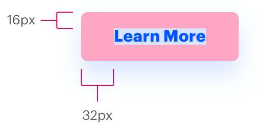
The Spirit visual style applies a squished inset to many smaller containers, such as pills and buttons. This “Squish” inset provides twice as much padding left/right as it does top/bottom.
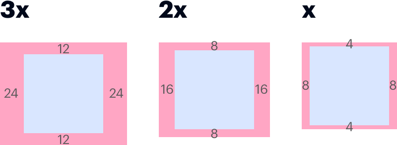
Apply inset-squish tokens to small containers, like buttons, to create wider padding around a text label.

| Token | Value | Preview |
|---|---|---|
|
|
24px 48px |
example |
|
|
16px 32px |
example |
|
|
12px 24px |
example |
|
|
8px 16px |
example |
|
|
4px 8px |
example |
|
|
2px 4px |
example |
Stack
Apply stack space below block-level elements to normalize vertical distance between components.
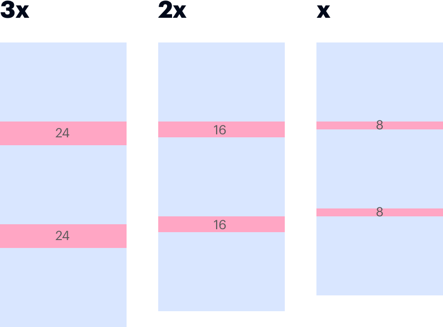
Use proximity to signal related elements. Use whitespace to form boundaries between components.

Tokens
| Token | Value | Preview |
|---|---|---|
|
|
0 0 192px 0 |
example |
|
|
0 0 96px 0 |
example |
|
|
0 0 64px 0 |
example |
|
|
0 0 48px 0 |
example |
|
|
0 0 40px 0 |
example |
|
|
0 0 32px 0 |
example |
|
|
0 0 24px 0 |
example |
|
|
0 0 16px 0 |
example |
|
|
0 0 8px 0 |
example |
|
|
0 0 4px 0 |
example |
Inline
Inline spacing separates inline elements by consistent applying space on one side of each element. By default, left-aligned elements have right-side spacing (as shown) using inline-right. Right-aligned elements are the opposite.
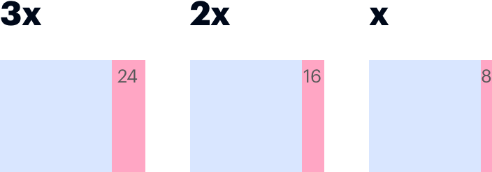
Use inline spacing to separate text, such as the inline links in a footer, or block elements, such as pills, tabs, or buttons.

Tokens
Left-aligned items use inline-right, which adds spacing to their right. This ensures the first item is flush left.
| Token | Value | Preview |
|---|---|---|
|
|
0 192px 0 0 |
example |
|
|
0 96px 0 0 |
example |
|
|
0 64px 0 0 |
example |
|
|
0 48px 0 0 |
example |
|
|
0 40px 0 0 |
example |
|
|
0 32px 0 0 |
example |
|
|
0 24px 0 0 |
example |
|
|
0 16px 0 0 |
example |
|
|
0 8px 0 0 |
example |
|
|
0 4px 0 0 |
example |
Right-aligned items use inline-left, which adds spacing to their left. This ensures the last item is flush right.
| Token | Value | Preview |
|---|---|---|
|
|
0 0 0 192px |
example |
|
|
0 0 0 96px |
example |
|
|
0 0 0 64px |
example |
|
|
0 0 0 48px |
example |
|
|
0 0 0 40px |
example |
|
|
0 0 0 32px |
example |
|
|
0 0 0 24px |
example |
|
|
0 0 0 16px |
example |
|
|
0 0 0 8px |
example |
|
|
0 0 0 4px |
example |
Generic Space
Although inset, stack, and inline spacing works in most cases, Spirit provides generic space tokens too.
Tokens
| Token | Value |
|---|---|
|
|
192px |
|
|
96px |
|
|
64px |
|
|
48px |
|
|
40px |
|
|
32px |
|
|
24px |
|
|
16px |
|
|
8px |
|
|
4px |