Container
A container is an often-invisible layout element that pushes in from the viewport edges, providing an outer margin and background styling to a row of content. A container often holds the grid component, used for detailed layout within the row.
Width Options
Containers come in two widths: large and full-width. They are identical on smaller devices, only deviating above 1080px viewport width.
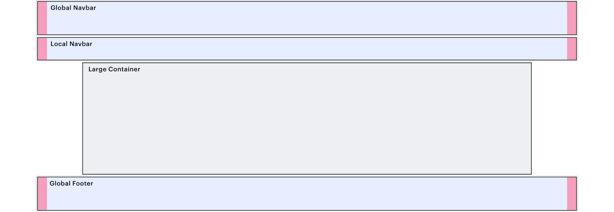
Large
The large container reaches a 1000px maximum width on large viewports.
<div class="spirit-container">
    <div class="spirit-container__inner spirit-container__inner--large">
        <h3>Large Container</h3>
    </div>
</div>- Never use vertical navigation in this container.
- Above 1080px, outer left/right margins are 80px. Width locks at 1000px.
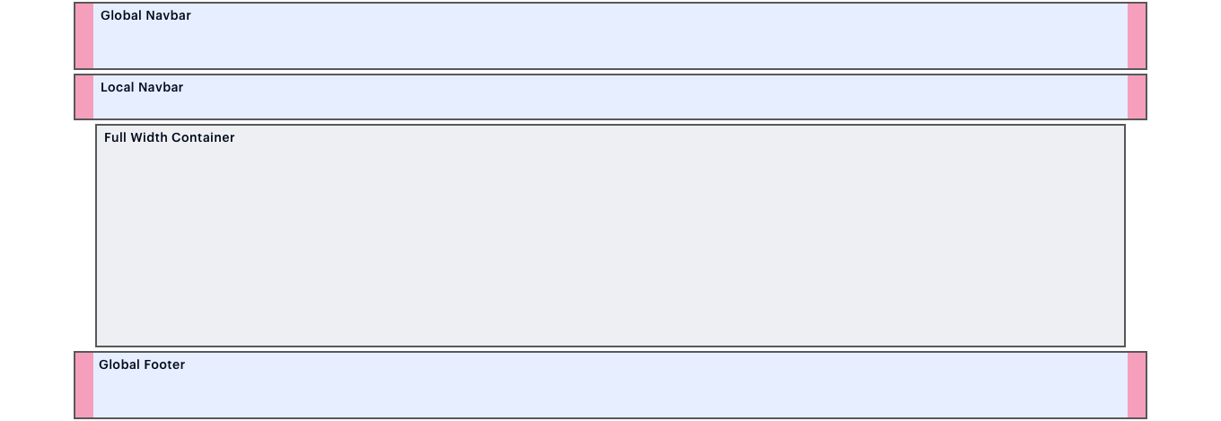
Full Width
The full-width container reaches a 1152px maximum width on large viewports.
<div class="spirit-container">
    <div class="spirit-container__inner">
        <h3>Large Container</h3>
    </div>
</div>- Use for sidebar-plus-body layouts, particularly with vertical navigation.
- Above 1080px, outer left/right margins are 24px. Width locks at 1152px.
Vertical Padding
Containers can be configured with vertical padding in four pre-set sizes: extra-small, small, medium, and large. These sizes are responsive, as shown below.
| Class | Below 1080px | Value | 1080px and up | Value |
|---|---|---|---|---|
|
|
|
24px |
|
32px |
|
|
|
32px |
|
64px |
|
|
|
48px |
|
96px |
|
|
|
96px |
|
192px |
Mix and match top and bottom padding sizes to fit your layout needs. The following full-width container has large top padding and extra small bottom padding.
<div class="spirit-container">
    <div class="spirit-container__inner spirit-container__inner--padding-top-lg spirit-container__inner--padding-bottom-xs"> Padding top lg and padding bottom xs </div>
</div>
Background Colors
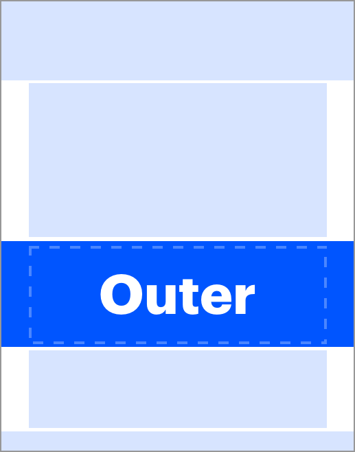
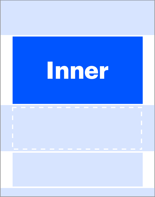
Containers provide two different background placement options: outer and inner.
| Outer | Inner |
|---|---|
|
|
|
|
|
|
Background Color Classes
Apply these helper classes to outer .spirit-container or inner .spirit-container__inner as shown above.
| Class | Color |
|---|---|
|
|
transparent |
|
|
|
|
|
|
|
|
|
Brushes
Brushes are a key hallmark of Spirit visual style. Container is one way to orient and structure brushes within a layout. For more information about brush specifications, see brush
Painted Edges
Use brushes to mask the top and/or bottom edges of a container’s background and contents. The brush mask creates the appearance of a brush stroke across the container.
Always use the JDRF blue background, .spirit-context--brand.
Painted Edge Example

Construction
- Set up the container normally, using either large or full-width size. All container padding options are compatible with brushes.
- Apply background color
.spirit-context--brandtospirit-container. - Add a helper class to
spirit-container__innerto modify it for painted edges, usingspirit-container__inner--painted-edge-top,spirit-container__inner--painted-edge-bottom, orspirit-container__inner--painted-edge-both. - Add a painted-edge svg to the top and/or bottom of the container’s content. Follow the code blocks below.
Top Painted Edge SVG
<div class="spirit-container__painted-edge-top">
    <div class="spirit-container__painted-edge-top-inner">
        <svg class="spirit-brush spirit-brush--painted-edge-top" aria-hidden="true">
            <use xlink:href="/brushes/spirit-brushes.svg#painted-edge-top"></use>
        </svg>
    </div>
</div>
Bottom Painted Edge SVG
<div class="spirit-container__painted-edge-bottom">
    <div class="spirit-container__painted-edge-bottom-inner">
        <svg class="spirit-brush spirit-brush--painted-edge-bottom" aria-hidden="true">
            <use xlink:href="/brushes/spirit-brushes.svg#painted-edge-bottom"></use>
        </svg>
    </div>
</div>
Wave Background
Use brushes to accent a row by adding waves to a container. The brush sits lower in the z-index than other content, peaking playfully from behind. See various examples below.
Wave 5 Example

Construction
- Set up the container normally, using either large or full-width size. All container padding options are compatible with brushes.
- Add a wave svg to the top or bottom of the container’s content. Follow the code block below.
Wave 5 SVG
<div class="spirit-container__wave-bg  spirit-container__wave-bg--wave5">
    <div class="spirit-container__wave-bg-inner">
        <svg class="spirit-brush spirit-brush--wave5" aria-hidden="true">
            <use xlink:href="/brushes/spirit-brushes.svg#wave5"></use>
        </svg>
    </div>
</div>