Card
Cards are a concise and scannable grouping of information, used as an entry point to more detailed content. Spirit cards come in various types and sizes, and can be used in many contexts. They are laid out in analogous decks, using a card grid.
Anatomy

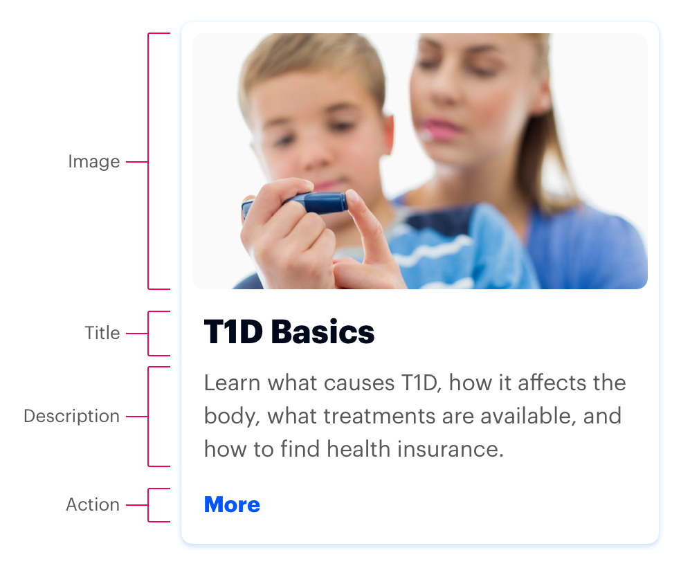
Title and Action are the only required elements.
Image
Helps differentiate cards and supports a card’s title. Use a 16:9 aspect ratio and keep the photo’s subject in the vertical and horizontal center of the frame. Some CSS cropping may occur at certain viewport sizes.
Title
Briefly summarizes the content.
Description
Optionally provides additional text to clarify or establish the content. Should not contain formatting or links. Avoid using a description when the title is sufficiently obvious.
Action
Accommodates a single action, typically a link to more detailed information. Visually, all actions in a row are vertically aligned.
This example is scaled for a 3-card row.
<a href="#" class="spirit-card" aria-label="Just Diagnosed? Start Here">
    <figure class="spirit-image" itemprop="image" itemtype="http://schema.org/ImageObject">
        <span class="spirit-image__image-wrap ">
            <img class="spirit-image__image" src="/images/card/diagnosed.jpg" alt="JDRF Walkers">
        </span>
    </figure>
    <span class="spirit-card__text">
        <h3 class="spirit-card__title">Just Diagnosed? Start Here</h3>
        <p class="spirit-card__body">Adjusting to life with T1D isn’t always easy, but we’re here to help. Find everything you need to establish your new normal.</p>
        <span class="spirit-card__cta">
            <span class="spirit-card__link">Learn More</span>
        </span>
    </span>
</a>
Text Only
Text only cards are used when the textual content should be the initial focal point for a user’s attention. They are made up of a title, a description and a call to action.
This example is scaled for a 3-card row.
<a href="#" class="spirit-card" aria-label="Just Diagnosed? Start Here">
    <span class="spirit-card__text">
        <h3 class="spirit-card__title">Just Diagnosed? Start Here</h3>
        <p class="spirit-card__body">Adjusting to life with T1D isn’t always easy, but we’re here to help. Find everything you need to establish your new normal.</p>
        <span class="spirit-card__cta">
            <span class="spirit-card__link">Learn More</span>
        </span>
    </span>
</a>
Sizes
Cards can be scaled according to the total amount of cards, resulting in 2-4 columns and 1 or many rows. Text and images scale with the overall card and are not independently configurable. The height of the cards in a row is determined by the tallest card’s height. The default card size (medium) is recommended for most situations.
Small
<a href="#" class="spirit-card spirit-card--small" aria-label="Living With T1D">
    <figure class="spirit-image" itemprop="image" itemtype="http://schema.org/ImageObject">
        <span class="spirit-image__image-wrap ">
            <img class="spirit-image__image" src="/images/card/living_with.jpg" alt="JDRF Walkers">
        </span>
    </figure>
    <span class="spirit-card__text">
        <h3 class="spirit-card__title">Living With T1D</h3>
        <p class="spirit-card__body">Get practical tips for dealing with T1D at all ages. Topics include nutrition, driving safety, and how to stay healthy while away at school or on vacation.</p>
        <span class="spirit-card__cta">
            <span class="spirit-card__link">Learn More</span>
        </span>
    </span>
</a>
Medium (default)
<a href="#" class="spirit-card spirit-card--medium" aria-label="Living With T1D">
    <figure class="spirit-image" itemprop="image" itemtype="http://schema.org/ImageObject">
        <span class="spirit-image__image-wrap ">
            <img class="spirit-image__image" src="/images/card/living_with.jpg" alt="JDRF Walkers">
        </span>
    </figure>
    <span class="spirit-card__text">
        <h3 class="spirit-card__title">Living With T1D</h3>
        <p class="spirit-card__body">Get practical tips for dealing with T1D at all ages. Topics include nutrition, driving safety, and how to stay healthy while away at school or on vacation.</p>
        <span class="spirit-card__cta">
            <span class="spirit-card__link">Learn More</span>
        </span>
    </span>
</a>
Large
<a href="#" class="spirit-card spirit-card--large" aria-label="Living With T1D">
    <figure class="spirit-image" itemprop="image" itemtype="http://schema.org/ImageObject">
        <span class="spirit-image__image-wrap ">
            <img class="spirit-image__image" src="/images/card/living_with.jpg" alt="JDRF Walkers">
        </span>
    </figure>
    <span class="spirit-card__text">
        <h3 class="spirit-card__title">Living With T1D</h3>
        <p class="spirit-card__body">Get practical tips for dealing with T1D at all ages. Topics include nutrition, driving safety, and how to stay healthy while away at school or on vacation.</p>
        <span class="spirit-card__cta">
            <span class="spirit-card__link">Learn More</span>
        </span>
    </span>
</a>
Card Grid
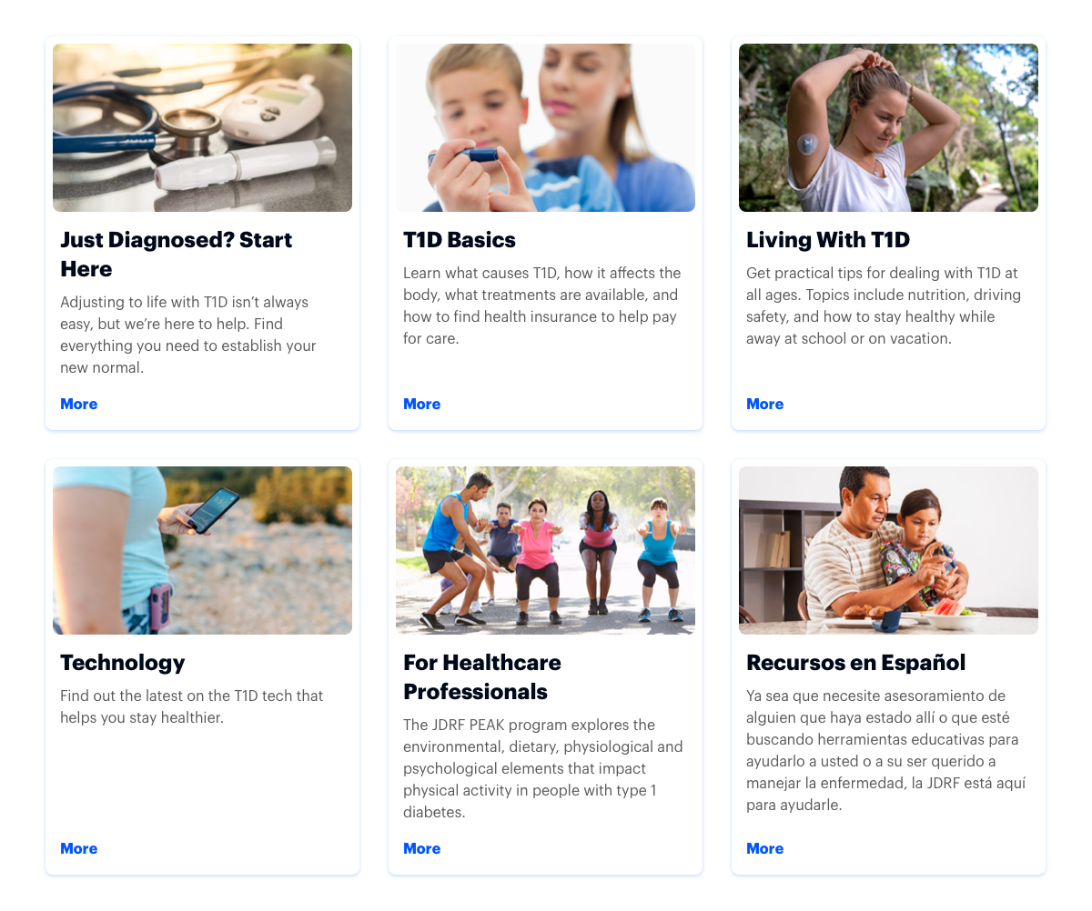
Cards are arranged in a grid with consistent card heights in each row. They are ordered from left to right, with the first card positioned at the top left. The number of cards per row is determined by the size of the cards and adapts to the available screen real estate (up to 4 on larger screens, and down to 1 on smaller screens).

The example above is an image. View a full-screen preview of card grid.
<div class="spirit-card-grid spirit-card-grid--3-up">
    <a href="#" class="spirit-card" aria-label="Just Diagnosed? Start Here">
        <figure class="spirit-image" itemprop="image" itemtype="http://schema.org/ImageObject">
            <span class="spirit-image__image-wrap ">
                <img class="spirit-image__image" src="/images/card/diagnosed.jpg" alt="JDRF Walkers">
            </span>
        </figure>
        <span class="spirit-card__text">
            <h3 class="spirit-card__title">Just Diagnosed? Start Here</h3>
            <p class="spirit-card__body">Adjusting to life with T1D isn’t always easy, but we’re here to help. Find everything you need to establish your new normal.</p>
            <span class="spirit-card__cta">
                <span class="spirit-card__link">Learn More</span>
            </span>
        </span>
    </a>
    <a href="#" class="spirit-card" aria-label="T1D Basics">
        <figure class="spirit-image" itemprop="image" itemtype="http://schema.org/ImageObject">
            <span class="spirit-image__image-wrap ">
                <img class="spirit-image__image" src="/images/card/basics.jpg" alt="JDRF Walkers">
            </span>
        </figure>
        <span class="spirit-card__text">
            <h3 class="spirit-card__title">T1D Basics</h3>
            <p class="spirit-card__body">Learn what causes T1D, how it affects the body, what treatments are available, and how to find health insurance to help pay for care.</p>
            <span class="spirit-card__cta">
                <span class="spirit-card__link">Learn More</span>
            </span>
        </span>
    </a>
    <a href="#" class="spirit-card" aria-label="Living With T1D">
        <figure class="spirit-image" itemprop="image" itemtype="http://schema.org/ImageObject">
            <span class="spirit-image__image-wrap ">
                <img class="spirit-image__image" src="/images/card/living_with.jpg" alt="JDRF Walkers">
            </span>
        </figure>
        <span class="spirit-card__text">
            <h3 class="spirit-card__title">Living With T1D</h3>
            <p class="spirit-card__body">Get practical tips for dealing with T1D at all ages. Topics include nutrition, driving safety, and how to stay healthy while away at school or on vacation.</p>
            <span class="spirit-card__cta">
                <span class="spirit-card__link">Learn More</span>
            </span>
        </span>
    </a>
    <a href="#" class="spirit-card" aria-label="Technology">
        <figure class="spirit-image" itemprop="image" itemtype="http://schema.org/ImageObject">
            <span class="spirit-image__image-wrap ">
                <img class="spirit-image__image" src="/images/card/technology.jpg" alt="JDRF Walkers">
            </span>
        </figure>
        <span class="spirit-card__text">
            <h3 class="spirit-card__title">Technology</h3>
            <p class="spirit-card__body">Find out the latest on the T1D tech that helps you stay healthier.</p>
            <span class="spirit-card__cta">
                <span class="spirit-card__link">Learn More</span>
            </span>
        </span>
    </a>
    <a href="#" class="spirit-card" aria-label="For Healthcare Professionals">
        <figure class="spirit-image" itemprop="image" itemtype="http://schema.org/ImageObject">
            <span class="spirit-image__image-wrap ">
                <img class="spirit-image__image" src="/images/card/peak.jpg" alt="JDRF Walkers">
            </span>
        </figure>
        <span class="spirit-card__text">
            <h3 class="spirit-card__title">For Healthcare Professionals</h3>
            <p class="spirit-card__body">The JDRF PEAK program explores the environmental, dietary, physiological and psychological elements that impact physical activity in people with type 1 diabetes.</p>
            <span class="spirit-card__cta">
                <span class="spirit-card__link">Learn More</span>
            </span>
        </span>
    </a>
    <a href="#" class="spirit-card" aria-label="Recursos en Español">
        <figure class="spirit-image" itemprop="image" itemtype="http://schema.org/ImageObject">
            <span class="spirit-image__image-wrap ">
                <img class="spirit-image__image" src="/images/card/spanish.jpg" alt="JDRF Walkers">
            </span>
        </figure>
        <span class="spirit-card__text">
            <h3 class="spirit-card__title">Recursos en Español</h3>
            <p class="spirit-card__body">Ya sea que necesite asesoramiento de alguien que haya estado allí o que esté buscando herramientas educativas para ayudarlo a usted o a su ser querido a manejar la enfermedad, la JDRF está aquí para ayudarle.</p>
            <span class="spirit-card__cta">
                <span class="spirit-card__link">Aprende Más</span>
            </span>
        </span>
    </a>
    <!-- These placeholder items prevent any orphaned cards in the last row from stretching to fill the available space -->
    <div class="spirit-card-grid__placeholder"></div>
    <div class="spirit-card-grid__placeholder"></div>
</div>
As in this example, include two invisible placeholder cards to prevent the card grid from stretching orphaned cards unpredictably.
Responsive Layouts
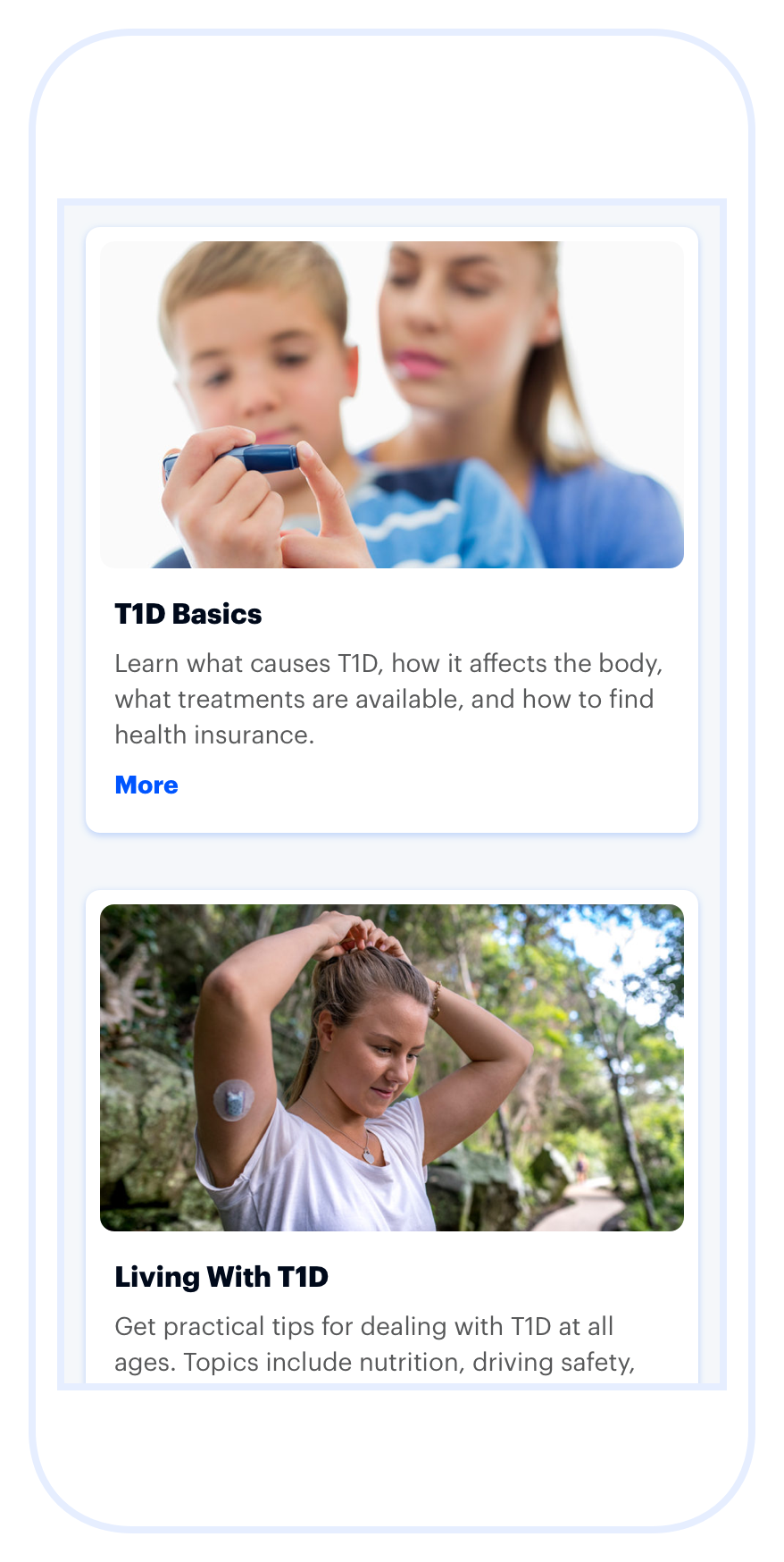
Cards can be presented in various ways on extra small screens: stacked (default), as a list, or in a carousel.
Stacked
By default, cards stack into one column.

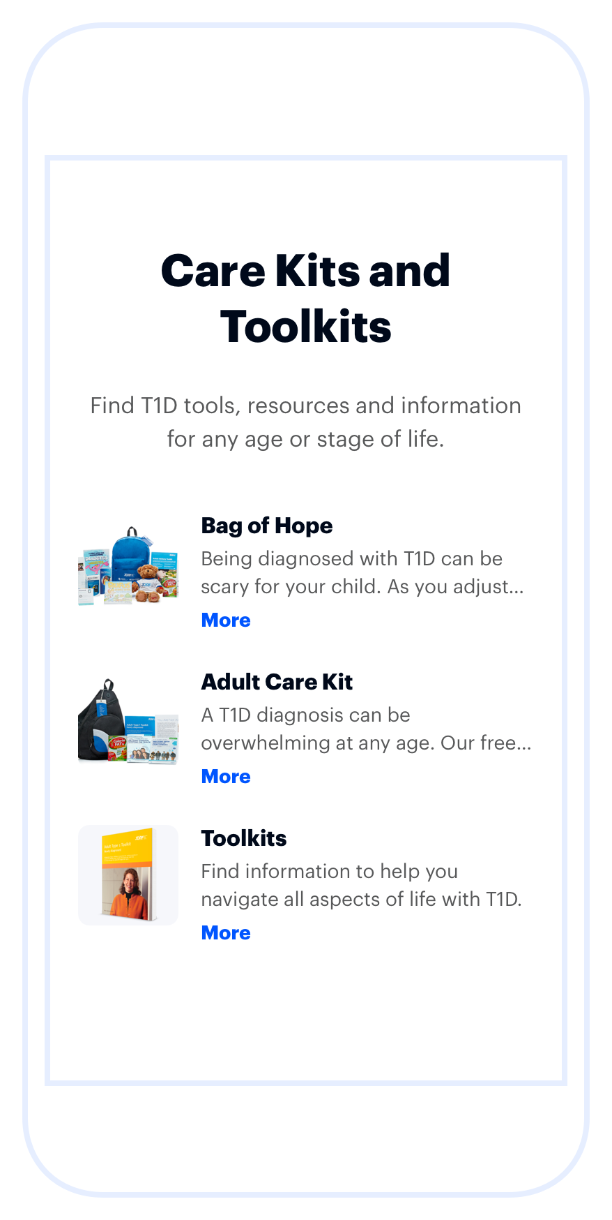
List
Cards can be shown in a list view to make comparisons across cards easier on small screens.

Carousel
Cards can be displayed in a carousel when the content of each card is unrelated to the others and needs no comparison. Use Spirit’s demonstration-only Javascript as a starting point for wiring up the carousel in your product.

Guidelines
Use When
Presenting multiple, easy-to-compare options.
Do not use when
Listing hierarchical or alphabetical options such as people, teams, donors, donations, events, or chapters. Use List.
Visual Language
Use a consistent arrangement of elements for every card in a card deck. For example, if some cards have an image and others don’t, consider using placeholder images or text cards, to keep the cards balanced and consistent.
Editorial
Titles
- Make titles concise and scannable.
- Set clear expectations about the card’s purpose.
- Avoid using punctuation such as periods, commas, or semicolons.
Descriptions
- Use full sentences with punctuation.
- Do not include multiple paragraphs.
Calls To Action
- Keep action labels terse. One or two words is ideal.
- Lead with a strong verb that encourages action.
Code Reference
| Class | Applies to | Outcome |
|---|---|---|
|
|
|
Applies the small size to the card, when not in |
|
|
|
Applies the (default) medium size to the card, when not in |
|
|
|
Applies the large size to the card, when not in |
|
|
|
Converts a card grid to a carousel on small viewports. See the code example above for the full structure. Requires Javascript. |
|
|
|
Converts a card grid to a list on small viewports. |
|
|
|
Invisible placeholder cards prevent the card grid from stretching orphaned cards unpredictably. Place two at the end of any card grid. |

